For this project, we worked together in a team of four, to create a solution for the topic of IoT-enabled Carbon Emission Awareness, for our course “User Interface Construction” at Aalto University. For this, we designed a carbon emissions tracking application for android smartphones. Our process started with performing background research as well as brainstorming sessions to decide on the different functionalities that could be included in our solution. Next, wireframes were created to allow for discussions on different design ideas, and in the end, all of the final designs and an interactive prototype were implemented.
I participated in all stages of the project implementation, since tasks for all parts were equally divided among the team members, however I focused more on creating several high fidelity screens, including the Homescreen, Emissions per Categories, and Review Activity.
Problem
Today, there is a shift towards using IoT-enabled solutions to improve societal problems, one of the most important ones still being climate change. One example of those solutions is smart cities, where Information Technology is merged with traditional infrastructures. The data generated from smart cities digital technologies, for example transport data, electricity usage data from sensors, personal electronics, and smart devices, can provide insights into one’s activities in detail, and could be used to calculate one’s carbon emission footprint quite accurately. In addition, the data available can provide a basis to find more personal points of improvement when it comes to carbon emissions in people’s personal environment.
Goal
The goal of this project was to design a user interface for a carbon calculator, in the form of an app, that can be used in smart city environments. The designed UI aims to give people insights into their carbon emissions and motivate them to reduce their emissions. We assume that the app is already connected to the person’s smart-city devices, and gets real data from there.
Interaction Medium
For this project, an Android application was chosen as the interface that users will interact with. The pervasiveness of smartphones provides the potential for the app to reach a wide audience and deliver a huge impact on the environment. And the portability can enable users to check their carbon emissions and receive suggestions on compensation almost whenever and wherever they want, without any extra effort.
Our Users
The users of the app are mostly people who care about climate and environmental issues. They are willing to reduce carbon emissions and deliver a positive impact through their daily activities or even some other more progressive approaches. Although most of this interface’s users want to keep track of their carbon emissions and take actions to compensate for it, they have different levels of knowledge related to this topic.
Users of the interface have various levels of literacy and experience in modern interactive digital products. But almost all of them use smartphones in their everyday life. They expect the interface to be intuitive and understandable.
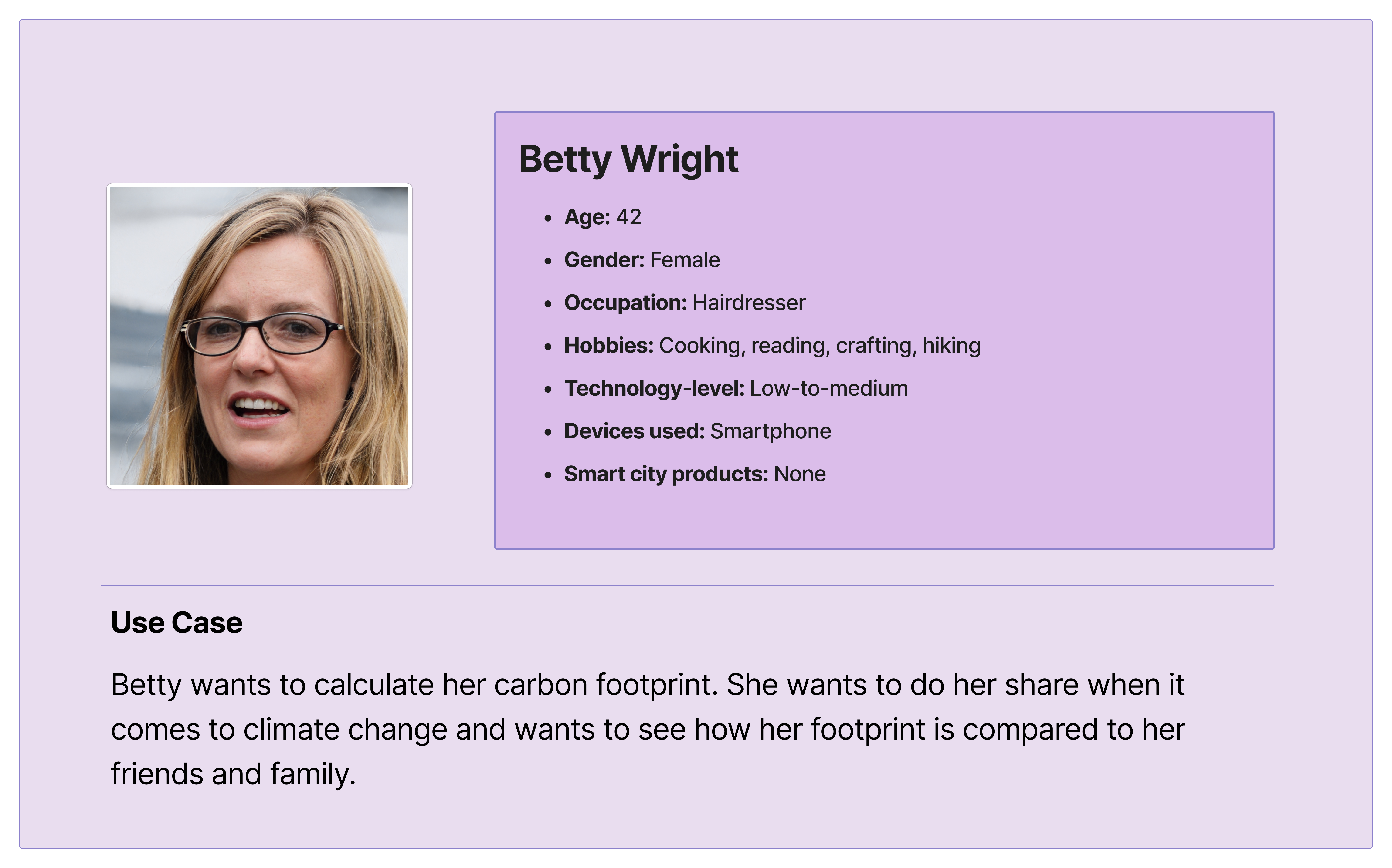
Before starting the design work, three main user groups were identified: users with smart city products they can connect with the app, of which Persona 1 is an example; users without smart city products, such as Persona 2; and users with smart city products but they are not willing to share their personal data, for example, Persona 3.
Persona 1
Persona 2
Persona 3
Limitations
The main limitation of this project is that we were unable to work together with the identified main user groups during the project. The design has not been tested and validated by possible users. As a consequence, the design may not fully correspond to the users’ wishes, or the usability of the app may not be as anticipated.
Another limitation of the proposed app is that we are unaware of the format of data that smart city products provide. In this project, we had a general view of smart city products and their usage. For future development, it should be taken into account that many different smart city products with varying providers exist. The data format of the data that the smart city products provide may vary from provider to provider.
Process
Task sequence
We first created the task flows for the main interaction, as well as the rest of the pages.
There are two different ways for users to start using the app.
Planned task sequence of the app
For existing users, they can simply open the app, and then they will be brought to the homepage. For first-time users, the first page for them is a welcome page where they can choose to create a new account. After creating the account, there will be a page for them to enter some basic information to help the app have a rough estimation of users’ carbon emissions. After that, users can choose whether to connect their smart city devices to the app, which can help calculate carbon footprint more precisely. If users agree to share smart city data with the app, they will be directed directly to the homepage. If users do not have smart city devices or are not willing to share their data, they will be brought to the page where they can answer some questions about their activities to help calculate emissions and form suggestions.
The Homepage shows an overview of the user's carbon footprint so far for the current week. From here, the user can perform three tasks: review their activity, see their emissions per category, and see tips that can help them lower their footprint.
Task sequence through the Homepage
The Review Activity page, allows the user to browse through different visualizations of their statistics as well as to select specific dates and see their progress over time.
Through the Emissions per Categorypage, the user can select to see a tip associated with each category, as well as to access the category details page. From this point, the user can also edit these details or add any missing data.
Through the Lower my Footprintpage, the user can get an overview of all tips combined for all categories.
The calculator consists of two parts. First, when the user enters the app for the first time, if they refuse to grant permission for Smart Cities data, they will be directed to the carbon footprint question page for a rough footprint estimation. Users are required to answer seven questions. Second, in the calculator tab, they can add and update their footprint-related data by manual input for a precise carbon footprint calculation.
Task sequence of a carbon footprint question page
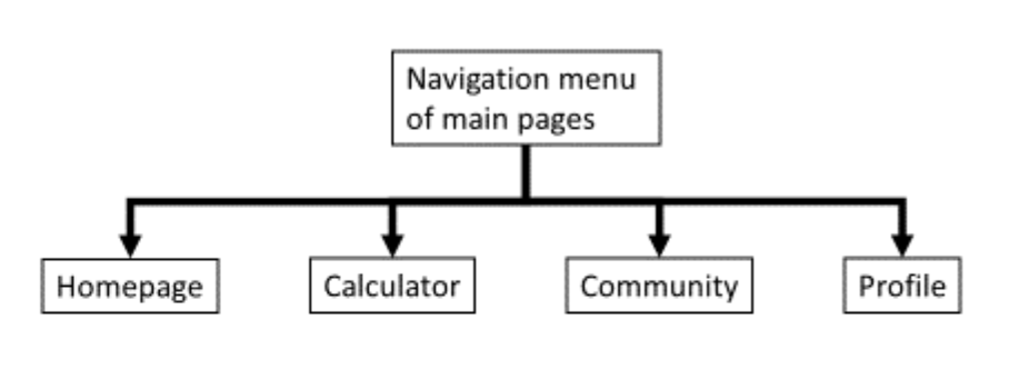
Via the navigation menu, the user can access the community page. On the community page, the user can see the weekly ranking and add friends.
Via the navigation menu, the user can navigate to the profile page. On the profile page, the user sees his/her personal information and can alter the personal settings.
Main pages in the navigation menu of the app
Sketching
Before starting designing, we discussed and tested ideas about how the screens would look like, by sketching them on paper.
Styleguide
After having an idea about the flow and the screens, we decided on the fonts and colors.
Green is the color most associated with nature, the environment, and life. Therefore, basil green was chosen as the primary color to expressively reinforce the topic of carbon emission awareness improvement. A color tool was used to generate two variants of primary color to distinguish elements. The contrast between dark and light green enables visual hierarchy that facilitates the prioritized arrangement of elements in design. Red was chosen as the error color to draw attention.
Final Designs
These are the final designs for each screen.
Welcome screen, create new account & permissions dialog
Here is a video prototype showing the flow and basic functionalities of the app:
Future
Our solution includes the most essential pages for the app and can be used as a basis for future developments. For this, further research on whether the app reminders, notifications, and tips can have an effect in altering people’s behavior is required.
A possible option for engaging users to interact more with the app, their emission output, and tips is to apply more gamification elements in the app. Users’ engagement could also be increased by adding rewards or challenges to complete, for example, by challenging the users to open the app daily during the week and rewarding them if they do so.